VIN — Making Connections the Product, Not the Event
A connection-first networking app for Dubai, spec'd end-to-end — then audited against the promises its own onboarding makes.
Company
Independent
Role
Product designer & strategist
Period
2026–
Type
Product
Industry
Social · networking · Dubai
Team
A separate development team built and shipped the running app and admin panel; Sina led product design and strategy.
Status
Shipped
Tools
Figma
Excel
Word
Get the app
Apple and App Store are trademarks of Apple Inc. Google Play is a trademark of Google LLC.
The problem
Event-discovery apps optimise for ticket sales; social apps optimise for time spent. Neither is the right shape for someone who needs five useful conversations, not another feed.
The role
Product design and strategy lead: the brief, the problem inventory and KPI model, the mobile UI and design system, the brand architecture and the B2B venue layer — alongside a separate development team.
The result
126 screens on a documented system, a 57-problem inventory and a locked cultural-rules instrument — audited against itself: two of four onboarding promises have no screen in the file.
Figure 01
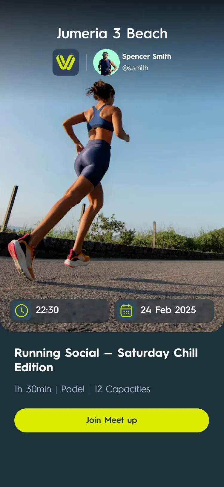
Figure 01Three of 126 screens: the chat-first creation flow, the venue-partner revenue layer, and a meetup in progress.
01Context
Events are not the product. Connections are.
VIN is a connection-first networking platform for the city's professional community. A traditional event app reads browse events, then maybe connect, with success measured in tickets sold. VIN reads set a connection goal, get an AI-suggested event path, attend, then log the connection.
The brief's north star is the Connection Logging Rate, targeted at 40%+ — explicitly not attendance, not app opens, not profile views. Dubai is the reason it works this way: high expat turnover, and networking that happens through activity — running clubs, padel, cycling — rather than conference halls.
Events are not the product. Connections are the product. Events are the medium.
02Problem
Not another event app, and not a casino playbook.
Event-discovery apps optimise for ticket sales, so they succeed whether or not anything came of the event. Social platforms optimise for time spent, importing infinite scroll and vanity metrics. Both are the wrong shape for someone who moved to Dubai three months ago and needs five useful conversations.
The product's own anti-definition is blunt about it: not another event-discovery app, not a social platform, not a dating app, not a matchmaking service, not a ticketing system.
03Constraints
Nine non-negotiable rules, before a single screen.
Several engagement patterns that work elsewhere are culturally wrong here — public leaderboards and competitive framing among them. The brief carries a long section on cultural considerations for Dubai: Ramadan scheduling, gender dynamics, alcohol, Arabic RTL support, and a three-phase cultural launch moving from expat professional to broader expat to Emirati integration.
The process that produced VIN was later codified into a reusable design-and-audit protocol, with nine non-negotiable Dubai cultural rules and a locked table of intentional design decisions, each carrying its own reason.
04My role
My role
Product design and strategy, working alongside a separate development team that built and shipped the running app and the admin panel.
Owned
↳The product brief, the problem inventory and the KPI model
↳The mobile UI and its design system
↳The brand and naming architecture
↳The B2B venue layer and its go-to-market copy
↳A QA review of the built app and a function scan of the admin panel
Co-owned
—
Collaborated
↳A separate development team that built and shipped the running app and the admin panel at admin.viwin.link
The brief documents the design and strategy work in detail; it doesn't specify the exact split of implementation decisions with the development team, so ownership here is limited to what's documented.
Six layers, each producing an artifact the next one used.
01
Brief3,716 lines: philosophy, three named personas, seven core flows, ten design principles
02
Inventory57 problems across five difficulty tiers, an 8-sheet workbook
05Roadmap
The roadmap started as a list of 57 problems.
Before any sprint was planned, every problem the product would face went into one inventory: 57 in all, each tagged with where it sits — attendees, hosts, the platform or VIN's own model. Each problem lists the features that could solve it and a KPI with a target. Then it goes into one of five tiers by effort, from quick wins that take days to fundamental tensions that are managed, never solved.
The KPI pack defines those numbers once. Each of its 20 KPIs has a plain formula, the segments to cut it by and a tracking status: one north star, twelve drivers and seven guardrails that watch for damage from growth. Only six could be measured on day one. The order of work then came from the tiers, as the four phases below.
Each item on the roadmap is a problem with a number attached, so the team can tell when it is solved.
The order of work, from the inventory's summary sheet
01
Sprints 1–2All eight quick wins: small fixes that remove obvious friction
02
Sprints 3–5Connection logging, positioning and the first visit: what VIN is to a new user
The two workbooks behind the roadmap
01
Problem inventory
57 problems in five tiers, each with the features that could solve it and a KPI target. Eight sheets, ending in a summary with the order of work.
Eleven sections, 126 screens, one documented system.
One App canvas holds the whole product — 17,589 nodes across 11 Figma sections: Profile (32 screens), Meet up Detail (33, including four cancellation variants), Chat (15), the Final Wizard (11), VIN Business (8, the B2B venue layer), Home (7), and five smaller flows.
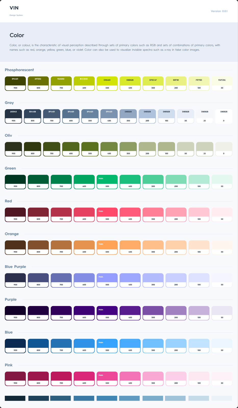
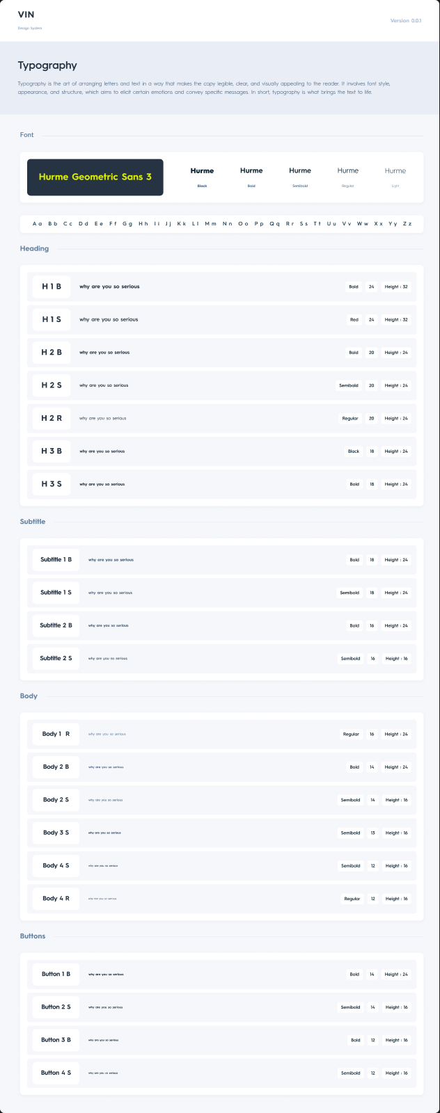
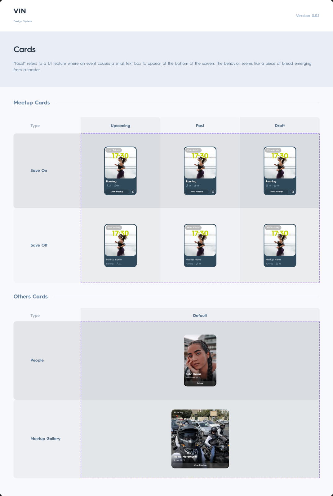
The design system runs on #1d2b3b with a phosphorescent #daed00 accent and Hurme Geometric Sans 3 — 21 named type styles and a deliberate radius system: 20px cards, 48px pill CTAs, 30px category chips, 32px tab bar. Cards are properly variant-driven, not duplicated per state.
07Solution
The thesis sits in the first screen of the most-used flow.
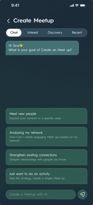
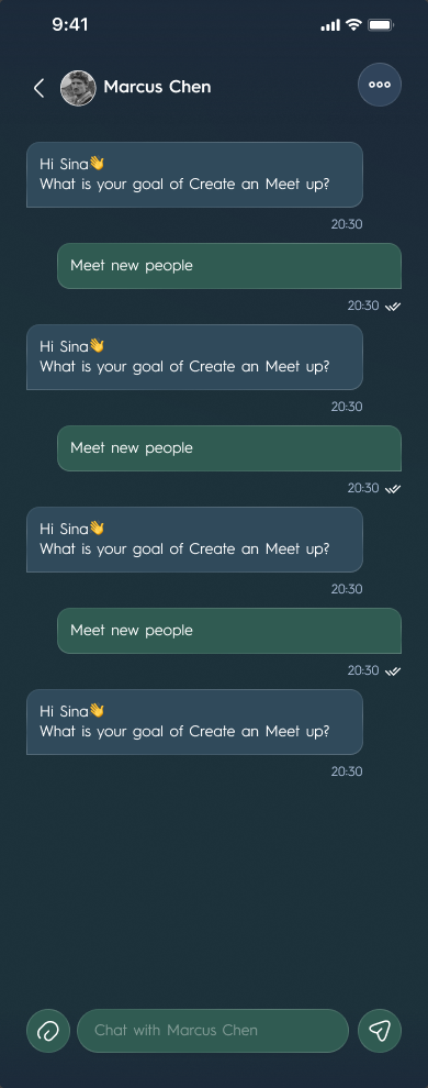
Meetup creation opens as a conversation, not a form: 'Hi Sina, what is your goal of Create a Meet up?' — with four intents, the fourth an honest escape hatch for people who don't want the strategy layer at all: meet new people, analyse my network, strengthen existing connections, or just do an activity.
Behind it sit four entry modes as a segment control — chat, interest, discovery, recent — and a composer labelled 'Create a Meetup with AI'.
The fourth option — 'just want to do an activity' — is the product being honest about the users who don't want its thesis.
01The flow opens as a conversation, not a form: "Hi Sina — what is your goal of create a Meet up?"
02"Meet new people — expand your network in a specific area." The default for a newcomer with no network in the city yet.
03"Analysing my network" and "Strengthen existing connections" — the two intents for people who already have a network and want it to work harder.
04"Just want to do an activity — skip the strategy, create a simple Meet up." The escape hatch, and the most honest line in the file.
05Chat, Interest, Discovery and Recent run across the top, and the composer below reads "Create a Meetup with AI" — four ways in, only one of them a conversation.
Figure 05Meetup creation — the flow a host uses most — opens by asking what the meetup is for. The product thesis, stated as the first question anyone answers.
08Key decisions
Key decisions
01
Retire 'Meetup' and 'Event' as vocabulary
VIN is the platform; Meet is the action — a fixed usage rule ('Join a VIN Meet', never 'Download VIN Meet App') so five planned verticals (VIN Party, VIN Challenge, VIN Business Walk, VIN Retreat) never force a rename.
Alternatives
A softer style-guide suggestion, left to individual copywriters.
Trade-off
The lock gives the architecture teeth — but the file itself still uses 'Meetup' and 'Event' everywhere, including its own section names; a locked decision still needs a migration pass to become real.
Evidence
Brand Architecture document, dated after the UI work
02
No public leaderboards, no competitive framing
Public leaderboards and competitive display read as culturally wrong for this market.
Alternatives
A public leaderboard ranking hosts or attendees, the usual engagement lever in fitness and event apps.
Trade-off
Removes a proven engagement lever; replaced with curated matching and connection goals instead.
Evidence
Nine non-negotiable Dubai cultural rules, part of the reusable design-and-audit protocol
09Solution
The venue layer is the business model, not a landing page.
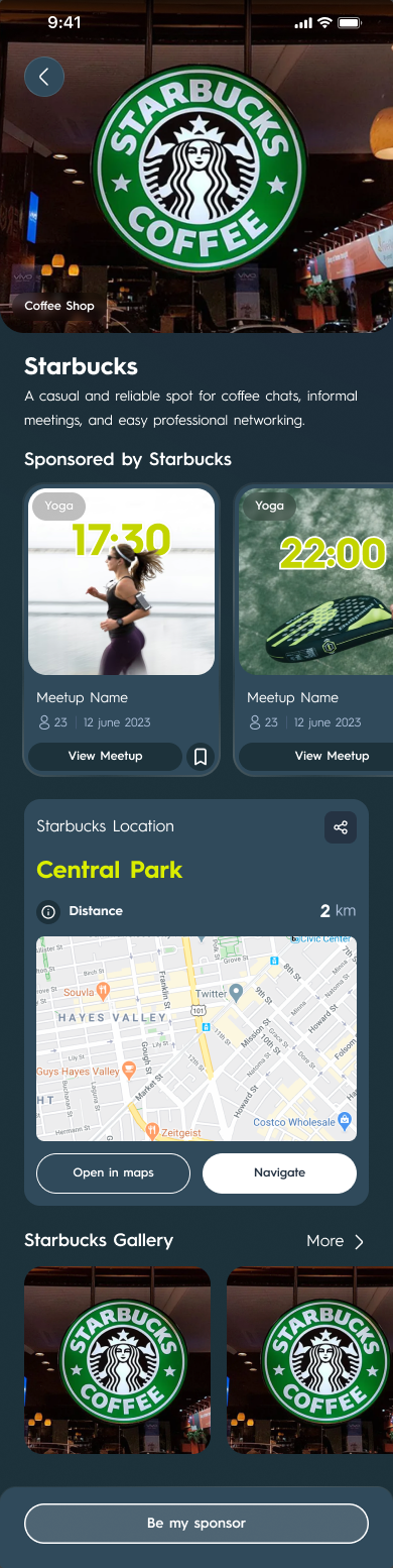
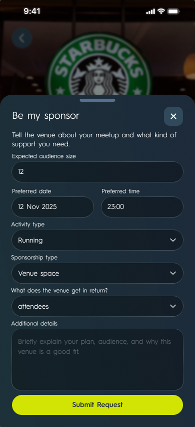
The VIN Business section runs a four-step partner funnel — list your venue, get matched, host and activate, measure and grow — and it's genuinely two-sided: hosts can bid for a venue through a 'Be my sponsor' flow with a suggested bid and a fair-price indicator, while venues review qualified requests instead of random traffic.
The pitch to venues is blunt: 'Empty seats aren't a marketing problem — they're a predictable demand problem.' The page even carries a legal disclaimer marking performance figures as indicative, not guaranteed, based on pilot data.
The venue funnel, four steps.
01
ListShare your space in two minutes: location, capacity, peak/off-peak hours, target audience
02
MatchVIN suggests relevant meetup groups by area, timing and audience fit
The venue page a member reaches from the feed
10Result
Built, not just drawn — and audited against its own promises.
The design was built and has shipped. Before launch, a dated QA review listed real implementation bugs in the running app — a failing bookmark API, screens that don't refetch on focus, a back-navigation dead end, stale 'requested' state after a host rejects a private join. A function scan of the live admin panel covered eight routes at roughly 85–90% discovery coverage, deliberately stopping short of destructive testing on production data.
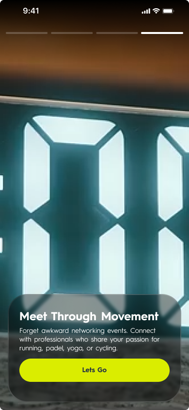
But the onboarding screen makes four promises, and the file designs two of them. Across all 17,589 nodes, none contains the word 'path' and none contains 'log' — no goal-setting screen, no AI path, no connection-logging interface.
01"Meet Through Movement" — connect with people who share your sport. Delivered: the home feed, the category chips, the map.
02"Who You Want to Meet" — "define your connection goals and we'll find the right events to get you there." No goal-setting screen exists in the file.
03"Show Up, Stay Active" — join activities that fit your schedule. Delivered: meetup detail, tickets, the join and cancel flows.
04"Your Network Grows With You" — "track your events, your connections, and the relationships that matter." No connection-logging screen exists either.
Figure 07Onboarding makes four promises across four slides. Searching all 17,589 named nodes for "path" and for "log" returns nothing: two of the four — the two the thesis rests on — have no screen behind them.
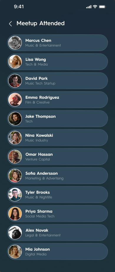
Meet up Detail → Meetup Attended
11Screens
Every screen in the file, flow by flow.
The App page in Figma holds 138 phone frames across eleven sections. Twelve are exact copies — the venue flow reuses the whole meetup wizard, and one edit screen appears twice — so 126 screens remain. All of them are below, in the order a person meets them: getting in, finding a meetup, joining or hosting one, talking about it, and the profile that holds the rest.
Ten frames needed care to be shown at all. Six sit at 10% opacity in the file and four under a canvas overlay, so each was rendered on its own at full strength. The sample account's email is pixelated and its profile photo blurred; the venue screens still carry a real coffee chain's brand as a placeholder.
12Launch
One story in seven frames, sized for every store.
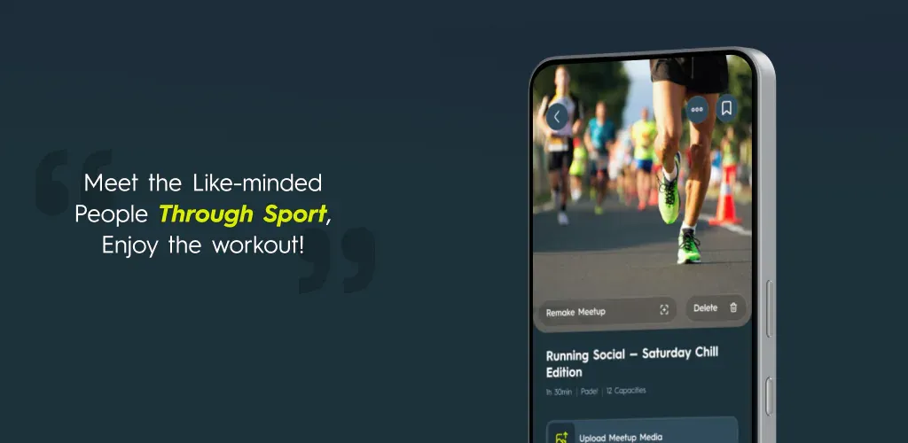
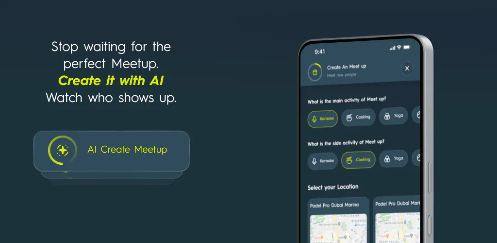
VIN is live as VIN.meet on the App Store and Google Play. Most people meet an app through its store screenshots before they open it, so the screenshots designed for its listing tell one story in seven frames. Each frame makes one claim and shows the screen behind it, in the app's own navy and lime: meet people through sport, a community ten thousand strong, the people you haven't met yet, a meetup made with AI, the people behind each meetup, the friends you bring, and the map that finds them.
The seven frames were then laid out again for every size the stores ask for: iPhone portrait and landscape at 6.5 and 6.7 inches, and Google Play's portrait and 1024 × 500 formats. That is 42 frames from one story, and none of them is a crop. The same look carries into a meetup cover for sharing outside the app, and into a set of 3D icons for VIN's brand guidelines, in the glassy lime of the app icon.
VIN's own store pages on 7 October 2026: 10K+ installs on Google Play, rated 4.7 there and 4.9 on the UAE App Store.
Figure 12A cover for sharing a meetup outside the app, built from the app's own cards: the place, the host, the time and date, and a Join button.
Meet (silver)
Meet
13Outcomes
Outcomes
These are design and audit outputs. The app's usage numbers are VIN's own: 10K+ installs on Google Play by October 2026.
screens shipped as spec
126
Across 11 Figma sections, on a 12-group, 221-component design system
Measured outcome · Figma file audit
problems inventoried
57
Across five difficulty tiers, each with an owning KPI and a difficulty rating
Measured outcome · Problem inventory workbook
onboarding promises with a matching screen
2 of 4
The goal-setting and connection-logging screens the thesis depends on have no frame in the file
Measured outcome · 17,589-node file audit
A dated, honest QA pass before launch
8 Feb review of real bugs in the running app, plus an 85–90%-coverage admin-panel function scan, stopped short of destructive testing
Delivered output · QA review + admin function scan
What was delivered
↳Product brief (3,716 lines)
↳57-problem inventory + 20-KPI dictionary (8- and 4-sheet workbooks)
↳126-screen UI on a 12-group design system
14What I learned
What I learned
01
A hard-to-move north star is a design constraint, not a metric choice
Connection Logging Rate can't be inflated by a notification or a better feed — it only moves if the product genuinely produced a connection worth logging. That one choice ruled out most of the standard engagement toolkit, which is what made the rest of the design coherent.
02
Upstream work can feel like progress that screens would have tested
The brief was written, 57 problems inventoried, 20 KPIs defined, 126 screens drawn — and the two features the whole thesis depends on still have no frame, while one already has a 60% target. A thin, ugly frame of the goal-to-log loop in week one would have surfaced the hard question earlier.
03
Non-negotiable survives arguments that advisory doesn't
'No public leaderboards' as guidance loses the first argument it has with a growth idea; phrased as a locked constraint with a stated reason, it holds. The same technique on vocabulary — declaring 'Meetup' and 'Event' discontinued rather than discouraged — gives the brand architecture teeth, though the file shows a locked decision still needs a migration pass to become real.
04
Designing the revenue layer as a product changes the consumer brief
Once venues are matched to groups and hosts bid for sponsorship, 'off-peak covers' becomes a real constraint on scheduling, group size and category mix — a far more specific brief than 'help people network'.
KPIs20 KPIs across nine domains — seven of them guardrails against growth's own damage
04
UI126 screens across 11 sections, on a documented design system
05
BrandA naming architecture that retires 'Meetup' and 'Event' as vocabulary
06
GTM & QAAn ASO pack, plus a dated QA review of the built app and admin panel
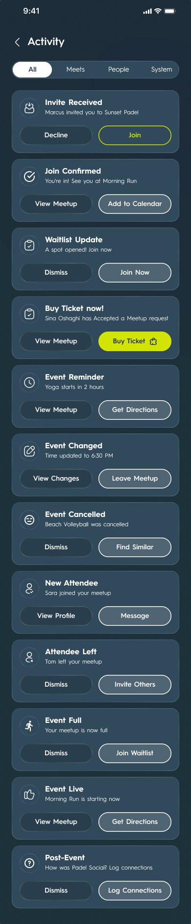
Figure 02One tab each: the home feed, tickets, chat and the activity log. Four of eleven sections — 126 screens sit behind them, on one component system.
03
Sprints 6–10No-shows, trust, social anxiety and host tools: what makes each meetup work
04
OngoingThe very hard tier and the fundamental tensions, as the user base grows
Figure 03Three of twelve component groups — 221 component nodes on their own design-system page, versioned independently of the app canvas.
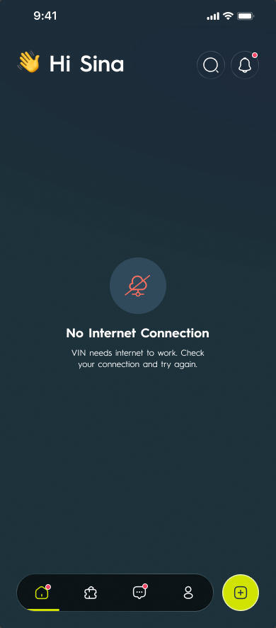
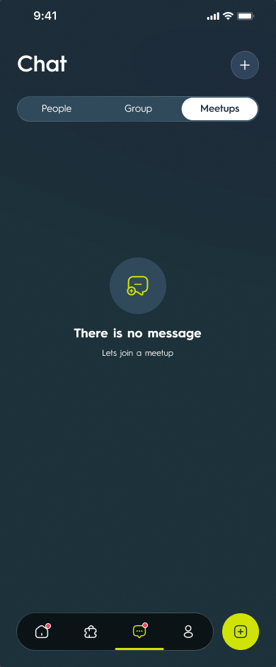
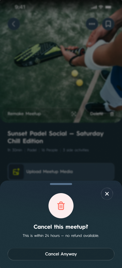
Figure 04The states a spec gets judged by: an offline screen that keeps the tab bar in place, an empty chat that points back at joining a meetup, and cancelling a paid meetup inside 24 hours — one of four cancellation variants, each with its own refund sentence.
03
Chat-first meetup creation, with a real escape hatch
Puts the AI-pathfinding thesis in front of every host at the moment of creation, rather than burying it in settings.
Alternatives
A plain creation form — which is what actually ships behind the fourth intent chip.
Trade-off
Costs a small amount of friction for someone who just wants to book a padel session; the fourth chip pays that back honestly instead of forcing the strategy layer on everyone.
04
Design the venue layer as a two-sided product, not a landing page
Matching venues to groups turns 'off-peak covers' into a real scheduling and group-size constraint on the consumer side, not just a sales pitch.
Alternatives
A single static partner-inquiry page.
Trade-off
Adds real product surface — eight screens of its own, including a bidding flow and a fair-price indicator, plus the meetup wizard it reuses — but it's what makes the 'real footfall, real revenue' claim to venues checkable rather than promised.
Evidence
VIN Business section: eight screens of its own plus the reused wizard, with a considered legal disclaimer on performance figures
03
HostTurn visits into spend — normal operations or an activated sponsorship perk
04
MeasureReview visits and spend signals, then schedule the next activation
The request its bottom button opens
Figure 06Both sides of the venue layer in one flow: the venue page ends in "Be my sponsor", and the sheet it opens asks for audience size, date, activity, sponsorship type and what the venue gets back. A landing page collects an enquiry; this collects a bookable offer. The venue itself is a real coffee chain standing in as placeholder content.
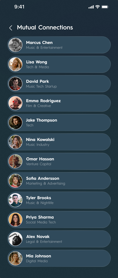
Profile → Mutual Connections
Figure 08Two sections, one screen: below the title these frames are pixel-identical — the same twelve people in the same order. Correct component reuse, and also the gap, because nothing in either screen separates "we were in the same room" from "we met."
Figure 09All 126 screens of the VIN app, in ten flows. Open one to see the whole screen.
Figure 10The App Store screenshots, frame by frame: seven claims, each over the screen that backs it. Open one to see it full size.
Figure 11The same frames laid out again for Google Play's 1024 × 500 format: the phone moves beside the headline instead of being cut to fit.
Ambassadors
Info
Community
VIN Party
Questions
Dubai
Sport
Notifications
Ads
Calendar
Time
Time (light bulb)
Figure 13Fourteen 3D icons made for VIN's brand guidelines, in the glassy lime of the app icon: from Meet and Community to VIN Party, Dubai and the calendar. Meet also comes in silver.
↳Brand & naming architecture
↳B2B venue-revenue layer (8 screens of its own)
↳ASO pack + Arabic/RTL localisation checklist
↳A reusable design-and-audit protocol (locked decisions, cultural rules, copy patterns)